Airbnb Redesigns Its App Around 'Slow Travel' and Longer Stays
The update is the most significant visual refresh in five years, with bigger photography and a new trip-planning tab.
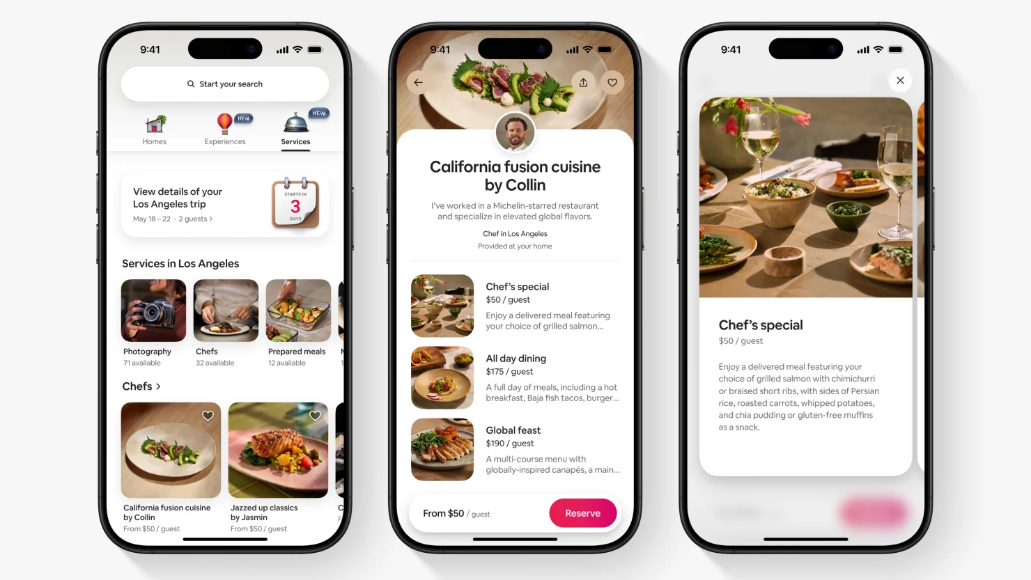
Airbnb's redesign pushes photography to full-bleed and demotes filters, a bet that browsing behaviour now resembles reading a magazine more than querying a database.
A new planning tab groups stays, neighbourhoods, and local recommendations into a single itinerary view aimed at guests booking weeks rather than nights.
Hosts get new tools to describe longer-stay logistics — workspaces, laundry, grocery access — details the company says drive disproportionate conversion above two weeks.
The redesign also quietly reduces urgency messaging, a reversal of years of scarcity-driven interface design.
Kyle Duford, Founder & Editor, BRNDWIRE. More from Kyle →