Coca-Cola Barely Touches Its Logo, and Rolls Out One Visual System to 200 Markets Instead
The Dynamic Ribbon, Arden Square, and Spencerian script all get turned up rather than replaced, while Coca-Cola Zero Sugar gets a bigger "Zero Sugar" callout and a black cap to stop it from being mistaken for the original at the shelf.
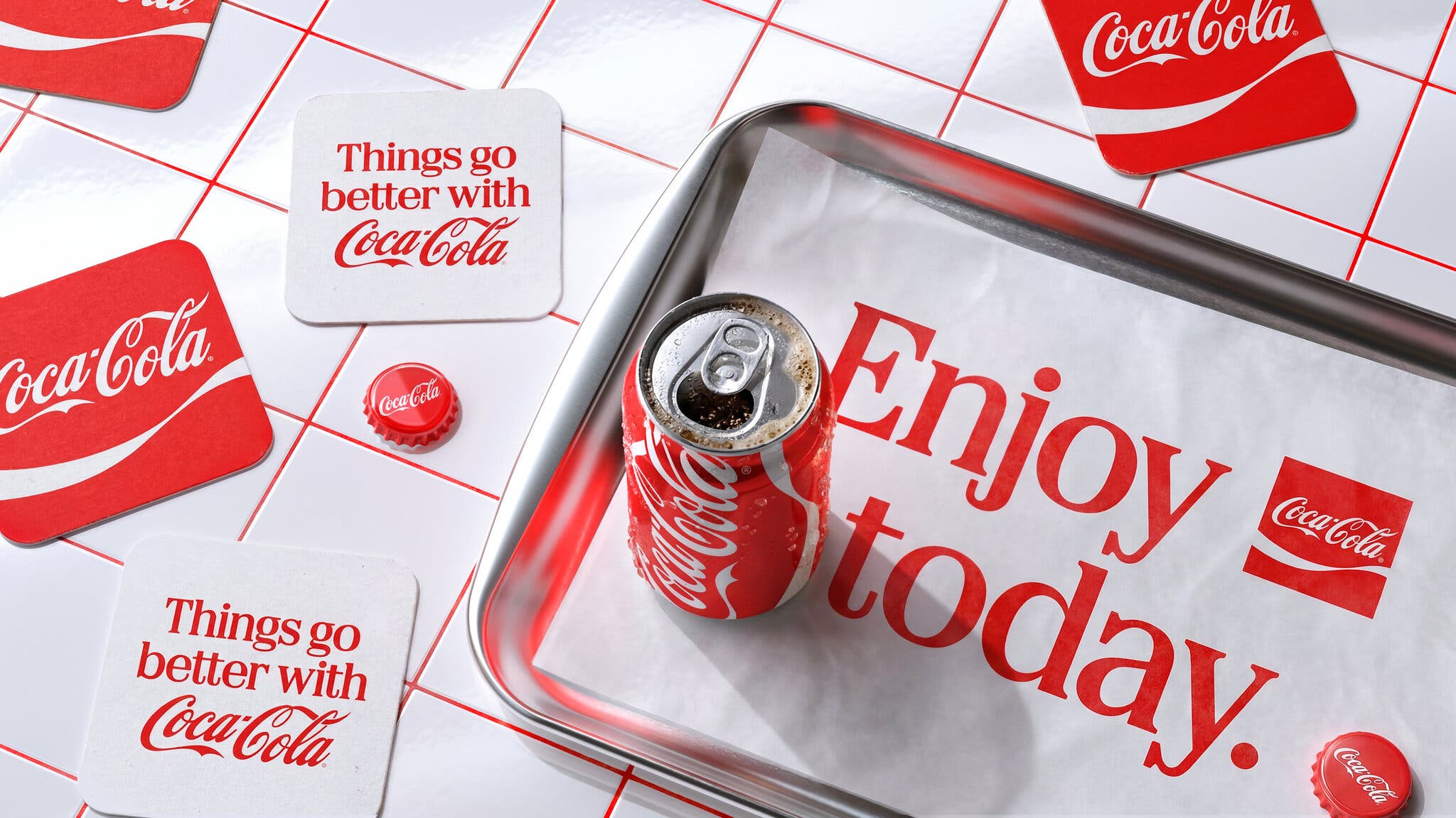
Coca-Cola is not touching the parts of its identity that already work. The company's global refresh keeps red and white as the primary palette and leans harder into the pieces that were already doing the heavy lifting: the Dynamic Ribbon, the Arden Square device, and the Spencerian script that has spelled the name since 1886, all pushed more prominently across packaging, retail environments, equipment, and digital.
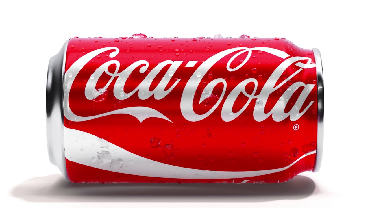
Coca-Cola Zero Sugar gets the most visible change: bigger "Zero Sugar" type, a black Dynamic Ribbon on the can, and a black bottle cap on PET packaging, all meant to make it unmistakable on a shelf next to the original without inventing a new brand voice to do it. "Coca-Cola is one of the most recognized brands in the world, and with that comes a responsibility to keep evolving," said Arnab Roy, president of Coca-Cola Global Category.
The real story is the plumbing, not the paint: Coca-Cola is rolling the system out across more than 200 markets, starting in Latin America, Europe, the Middle East, and Asia, backed by a new internal Brand Center and Design Intelligence tools meant to keep hundreds of agencies and bottlers from quietly drifting off-brand the way global systems always do. "Now, with one seamless visual identity, we can deliver one recognizable brand experience to consumers," said Rapha Abreu, global vice president of design, which is a polite way of saying the old system had started to look different depending on which country you were standing in.
More photos
Source: The Coca-Cola Company
Kyle Duford, Founder & Editor, BRNDWIRE. More from Kyle →