Coca-Cola Redraws Inca Kola's Logo, and Peru Notices What is Missing
Design shop Epoch simplified the 91-year-old Peruvian soda's logo for Coca-Cola, and stripping out the outline of Peru itself has fans calling the refresh a step toward blending in, not standing out.
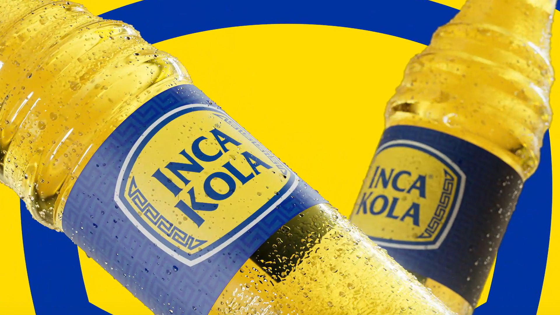
Coca-Cola just gave Inca Kola its first real redesign in years, and Peru has opinions about it. Design studio Epoch stripped the white borders and the outline of Peru from the 91-year-old soda's logo, cleaned up the type, and built a new sonic logo out of the clink of a glass bottle, all detailed in a rebrand unveiling from Dieline this week.
The timing is not random. Newer Peruvian sodas like Issac Kola, Triple Kola, and Peru Kola have been copying Inca Kola's yellow-and-blue playbook closely enough to dilute it, and Coca-Cola needed the logo to do more work standing out on a shelf that increasingly looks like a tribute act.
The backlash is about what the redesign gave up to get there: dropping Peru's silhouette from the mark, critics say, trades a built-in claim to national identity for a cleaner, more exportable logo, right as PepsiCo's Triple Kola leans on the same blue and yellow. Coca-Cola owns the Inca Kola trademark outside Peru and half of the business inside it, which is exactly why a "global" redesign reads, to some Peruvians, like the parent company quietly sanding off the one thing that made this cola theirs.
More photos
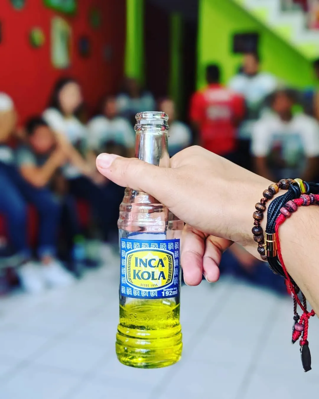
Source: Dieline
Kyle Duford, Founder & Editor, BRNDWIRE. More from Kyle →