Guinness Modernizes Without Touching Its Logo
A new campaign for the stout hides the brand's most recognizable asset inside a single word, which is a lesson in restraint most rebrands ignore.
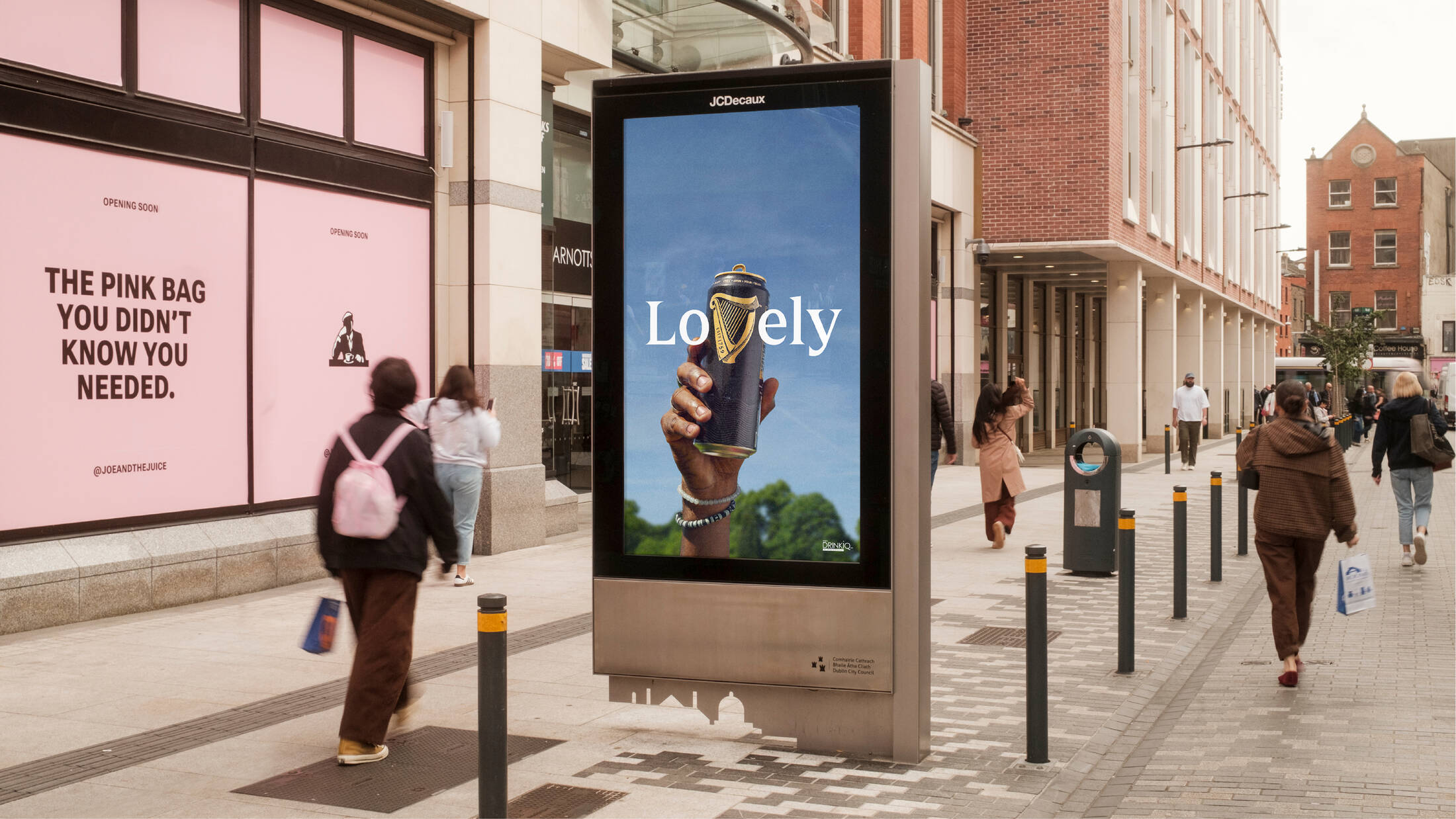
Guinness has a new campaign out, and the design press is paying attention for a reason that has nothing to do with beer.
The work smuggles the brand's most recognizable asset into a single word rather than restating it. No new logo, no refreshed wordmark, no announcement that the identity has evolved. The equity stays exactly where it is, and the campaign borrows against it instead of remodeling it.
That restraint has deep roots. The Irish brewer did not advertise at all for roughly the first 170 years of its existence, on the theory that the beer should do the talking. When it finally relented after the First World War, it did so under equally strict rules, and those rules are why the brand's visual assets have survived a century of fashion cycles intact.
The contrast with current practice is unflattering. Most brands facing a relevance problem reach for the identity first, because a new logo is visible, briefable, and easy to present to a board. It is also the fastest way to spend down recognition that took decades to build.
What Guinness demonstrates is the cheaper alternative: keep the assets fixed and move the ideas. Distinctive brand assets compound only if they are left alone long enough to compound, and a campaign is a far better place to experiment than a trademark.
The practical takeaway for marketers is unglamorous. Before you commission a redesign, check whether the thing you actually need is a better line.
Maya Chen
Senior Retail Correspondent, BRNDWIRE. Covering culture for strategists and marketers worldwide.