Instagram Redesigns Its Logo for the First Time in a Decade, and the Internet Renames It Instagzam
The script wordmark got flattened serifs, a quieter gradient, and a new viewfinder motif built from the camera glyph, all in service of a brand system Meta says puts creativity and self-expression first. Users mostly noticed it is harder to read.
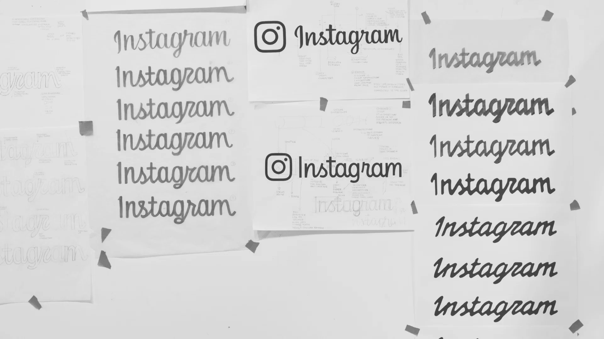
Instagram redrew its own signature for the first time since 2016, and the internet immediately renamed it. The refreshed script wordmark flattens and detaches its serifs, keeps the sunset gradient in reserve as a "light leak" effect rather than the dominant color story, and adds a viewfinder device built out of the old camera glyph to frame photos across the app. Meta's internal design team led the work, resisting the temptation to drop the script entirely after testing showed a non-script version simply did not read as Instagram anymore.

The brief was bigger than a typeface. New custom fonts, Instagram Pen for handwriting and Instagram Sans Mono, join a refined Instagram Sans, and the whole system leans on contact sheets, registration marks, and annotations to put "everyday creativity" back at the center, according to creative director Christy Silva. "Growing up means acknowledging there are more sides to Instagram now," said director of brand design Cynthia Pratomo, of a brand old enough to need to reconcile its scrapbook roots with everything it has become since.
None of that stopped the internet from deciding the new wordmark is simply harder to read, coining "Instagzam" and a handful of less printable variations within a day of launch. Instagram head Adam Mosseri's stated reasoning, that it was just "time for a refresh" after a decade, did not help: a justification that fits a kitchen repaint better than a rebrand invites exactly the kind of scrutiny a script nobody can parse is going to get.
More photos


Source: It's Nice That
Kyle Duford, Founder & Editor, BRNDWIRE. More from Kyle →