McLaren Redraws Its Own Logo, Using a 1958 Garage Sign as the Brief
The wordmark gets a new underline, the color palette expands past papaya, and the whole thing traces back to Bruce McLaren's parents' service station in Auckland.
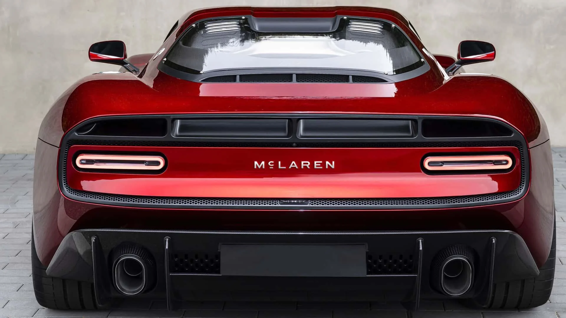
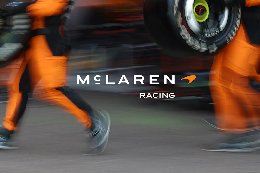
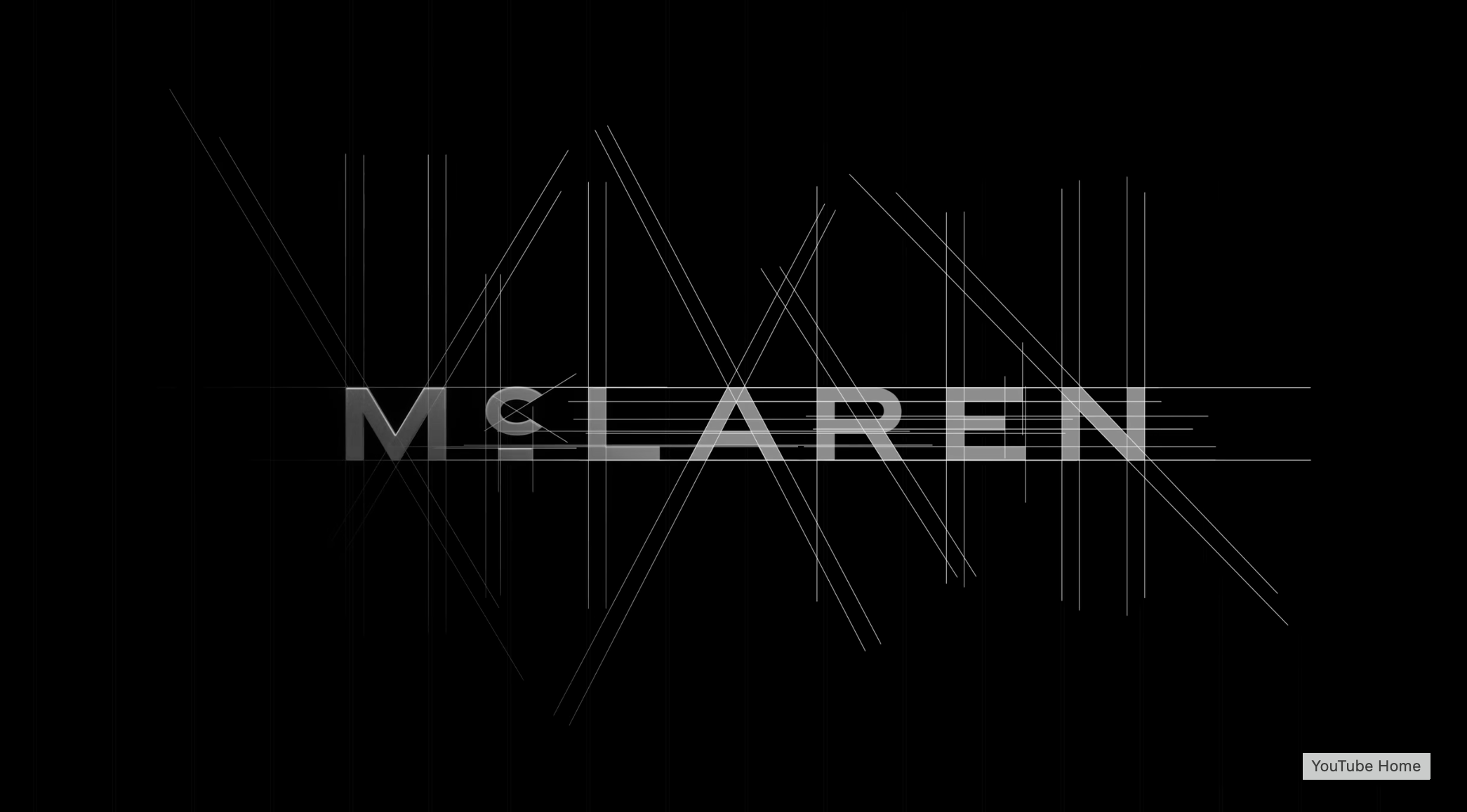
McLaren unveiled an evolved brand identity on Monday, September 22, 2026, timed to land ahead of the Azerbaijan Grand Prix and applied across both McLaren Racing (Formula 1, IndyCar, and the World Endurance Championship, launching 2027) and McLaren Automotive. It is the company's first identity update in years, and it is built around a font change rather than a fresh mark: a new wordmark with an underlined lowercase "c," a direct nod to founder Bruce McLaren.

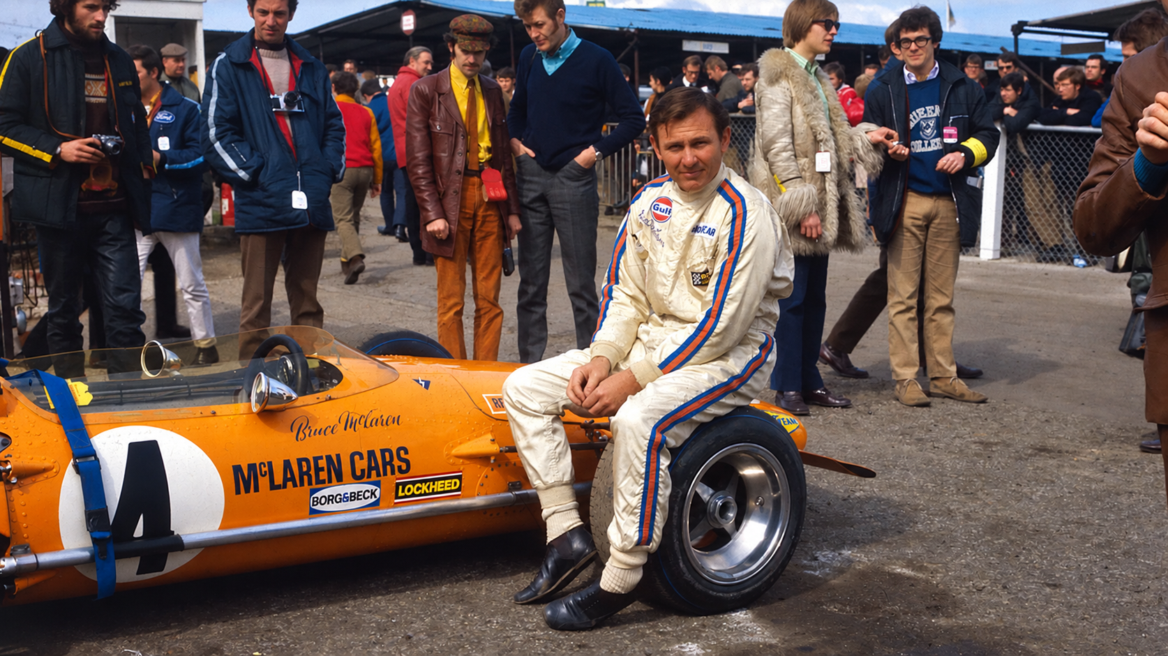
The reference point is oddly specific. The new lettering takes its cue from the sign above the family service station in Remuera, Auckland, that Bruce's parents, Les and Ruth, ran, and where he built his first racing car. The Speedmark symbol stays in place as the brand's anchor, as does the Speedy Kiwi that has long nodded to McLaren's New Zealand roots, but the papaya color that defines the brand on track now sits inside a wider palette pulled from what the company calls "pivotal moments" in its history.
"This evolution captures our spirit of innovation and forward momentum shaping our future," said David Woodhouse, chief creative officer at McLaren Automotive. Lou McEwen, chief marketing officer at McLaren Racing, framed it as a balancing act: "This evolved identity bridges proud heritage with future ambition, celebrating symbols fans know while expressing where we're headed." For a brand that has spent recent years expanding well past a single F1 garage, tying the new look explicitly back to a 1950s family workshop is a deliberate bet that heritage, not novelty, is what actually differentiates a supercar-and-motorsport brand crowded with newer, louder rivals.

More photos
Kyle Duford, Founder & Editor, BRNDWIRE. More from Kyle →