Nintendo gives Mario his first new logo in 15 years
A quietly updated Super Mario wordmark appeared on Nintendo's website on Sunday, trading the flat black outline for a metallic bevel — and history says a refresh means a release.
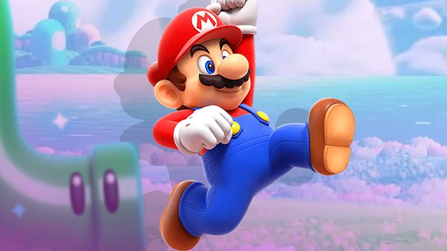
Most brands refresh a logo and hold a press conference. Nintendo put a new Super Mario wordmark on its website and said nothing, which is a considerably louder move.
The redesign arrived on the Nintendo site over the weekend, while attention was elsewhere — on the Legend of Zelda: Ocarina of Time remake. The familiar colors and letterforms survive intact, and the mark is still readable to anyone who has never held a controller. What changed is the finish: the flat black outline is gone, replaced with a gray bevel that reads almost metallic, and the letters now carry a glossy, toy-like volume. It is depth added without redrawing anything.
The restraint is notable given how little this identity has moved. In an era when brands refresh every two or three years, the Super Mario wordmark has sat untouched since 2011, when a tweak turned the "S" blue and the "U" yellow and introduced plumper, tighter letterforms with a stronger inner shadow. The new design keeps those choices and simply lifts them off the page. For now, Nintendo is using the mark horizontally only; whether a stacked version follows is unknown.
Which is where the speculation starts, and why it is reasonable. The last refresh was not cosmetic housekeeping — it landed alongside Super Mario 3D Land in 2011. A company that leaves a logo alone for 15 years and then polishes it in silence is usually clearing the shelf for something.
The brand discipline is worth naming regardless of what ships. Mario's equity is in recognition, not novelty, and Nintendo treated the wordmark accordingly: same colors, same letters, new light. That is what a mature identity update looks like when the asset is already doing its job.
More photos

Kyle Duford, Founder & Editor, BRNDWIRE. More from Kyle →