Šariš Shrinks Its Decoration and Supersizes Its Letter
Outlaw's redesign turns the caron above the Š into a spark and hands the can over to one enormous sculptural letterform.
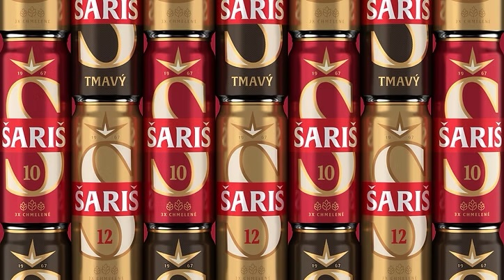
Šariš has rebranded, and the shortest description of the work is subtraction. The Slovak beer brand's previous look leaned on a decorative wordmark and a star motif. The new system, designed by Outlaw, drops most of it.
What remains is an enormous sculptural S that dominates the can, with the caron above the Š reworked into a sharp spark. Typography carries the personality now — proud, direct, and legible from across an aisle — while restrained hop symbols replace the ornamental furniture that used to fill the space.
This is the dominant grammar in packaging right now for a practical reason: shelf attention is measured in fractions of a second, and oversized brand marks let a shopper process a can before reading it. Decoration competes with recognition. A single vast letter does not.
The interesting choice is what Šariš kept. Rather than reinventing itself away from regional heritage, it took the one asset consumers already knew — the name and its distinctive diacritic — and gave it room. The equity survives the cleanup, which is precisely what separates a rebrand from a restart.
The trade-off is that a simplified system leaves fewer places to hide. Without ornament, everything rests on the letterform, the color, and the discipline of whoever applies it across formats. Done well, that reads as confidence. Done loosely, it reads as generic — and the current shelf is crowded with brands making the same bet.
Sofia Alvarez
Culture Correspondent, BRNDWIRE. Covering retail for strategists and marketers worldwide.