7UP lets the red dot break the green
A new packaging system from Deutsch turns the brand's oldest asset into a disruption device, and flips Lemon Lime around while it is at it.
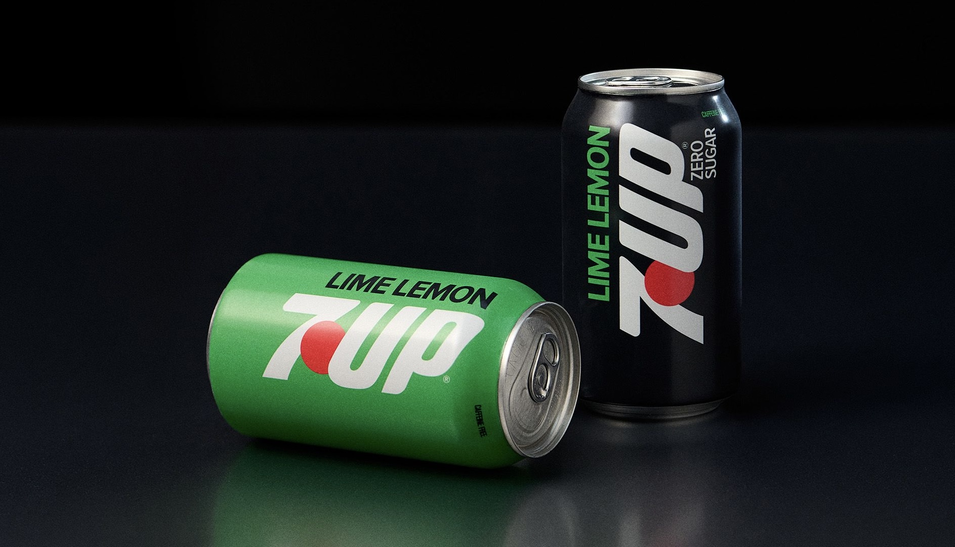
7UP has a problem that has nothing to do with taste: in the lemon-lime aisle, everybody is green. Its new packaging system, created with Deutsch, solves for that by taking the brand's most familiar asset and using it as a weapon rather than a decoration.
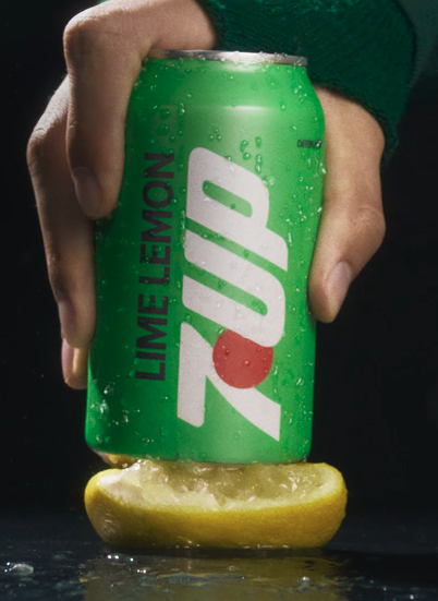
The red dot now bursts through a brighter, more saturated green instead of sitting politely inside the wordmark. In a category where green reads as the default, a hard red interruption is the cheapest attention the brand owns — and it is an asset 7UP has held for decades, so nothing has to be taught.
The cheekier detail is the copy. Packs invert the familiar Lemon Lime to read Lime Lemon, a small piece of mischief that ties the design back to the brand's "Whatever the world expects, 7UP 'Un's it" positioning. It is the sort of thing that sounds trivial written down and works on a shelf, because a shopper who has read the same two words in the same order for thirty years will notice.
What is notable strategically is what Deutsch did not do. The brief could easily have produced a full reset — new mark, new palette, a modernized sans serif, and a press release about simplicity. Instead the team remixed what was already recognizable, which keeps the equity and buys the disruption at the same time. That is a harder exercise and a safer one.
The redesign also reads as a bet on the younger end of the aisle, where playfulness and a strong visual signature travel further than heritage claims. Whether it moves volume will come down to execution in store, where a pack lives or dies at arm's length in about a second. This one at least gives a shopper something to catch on.
More photos
Kyle Duford, Founder & Editor, BRNDWIRE. More from Kyle →