A Year After Cracker Barrel, Everyone Is Redesigning Again
7-UP, Betty Crocker, Waterloo and LifeLock have all rolled out new looks. The lesson they learned from last year's blow-up was not "stop."
The most quoted cautionary tale in identity design right now is Cracker Barrel, which in August 2025 traded its country-store visual language for something flatter and spent weeks inside a sociopolitical firestorm for it. The industry read that as a warning. It did not read it as a stop sign.
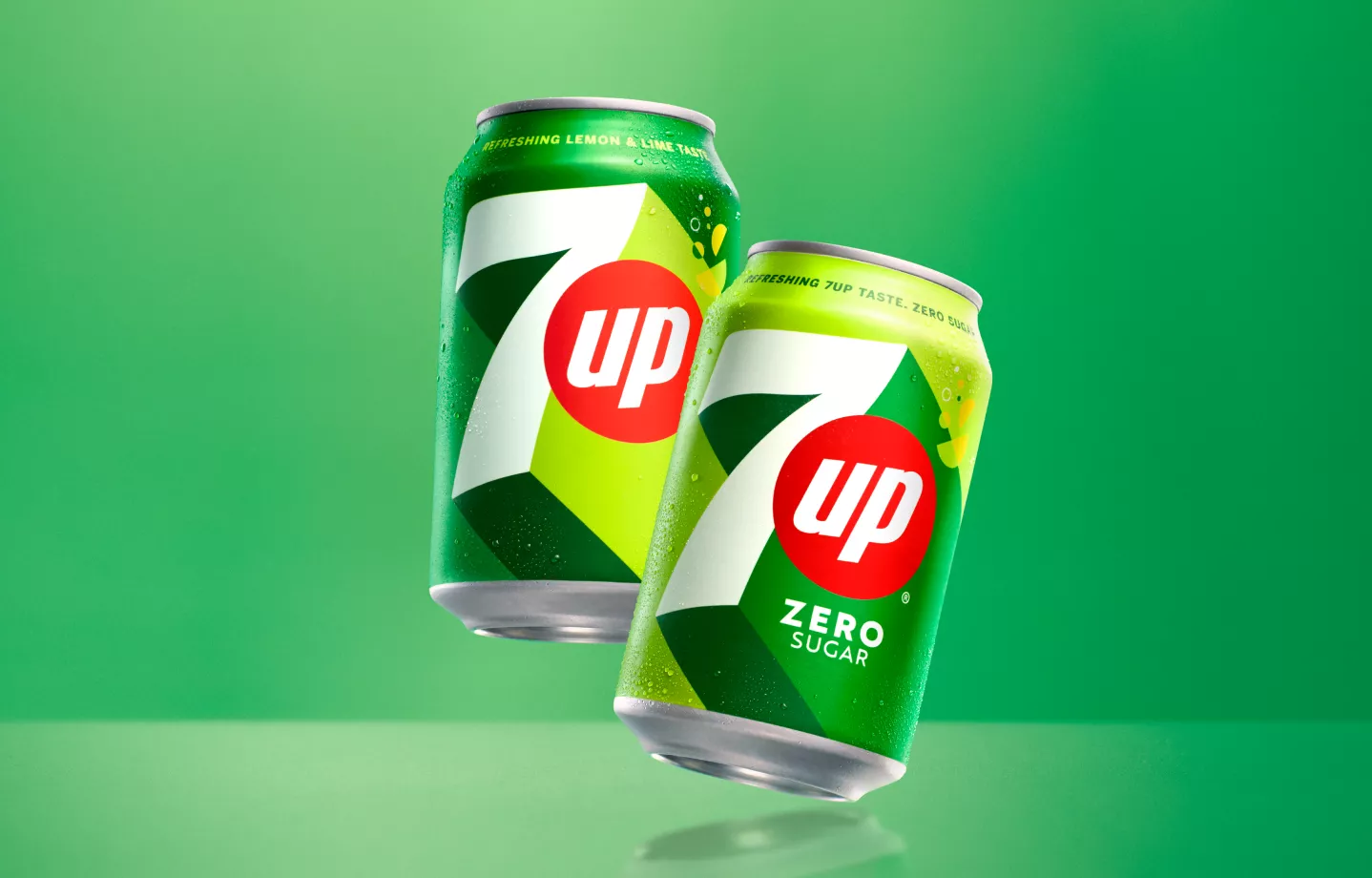
A new crop of refreshes has landed, and the brands behind them are unusually willing to explain themselves. 7-UP, Betty Crocker, Waterloo and LifeLock have each shipped new looks, and each has framed the work as continuity rather than reinvention.
That framing is the actual takeaway. What went wrong at Cracker Barrel was not a bad logo, it was a bad transfer: equity that lived in warmth and specificity was swapped for equity that lived nowhere. The refreshes now arriving are keeping their load-bearing assets — the colour, the name lockup, the character, the shape of the pack — and modernising around them.
There is a commercial reason for the timing too. Digital shelves and small-format screens punish detail, and a mark built for a 1990s package performs badly as a 40-pixel avatar. Heritage food and beverage brands in particular are being rebuilt for the thumbnail, not the billboard.
The safer play is not to leave the logo alone. It is to know which part of it consumers actually own.
Kyle Duford, Founder & Editor, BRNDWIRE. More from Kyle →
The Brand Briefing
Liked this? Get five more every morning.
The Brand Briefing: the stories moving brands, in your inbox at 7am your time. Free.