Fulham Dug Through 145 Years of Stadium Lettering to Build a Typeface Nobody Asked For
Creative agency Music and type foundry F37 built Fulham FC a bespoke typeface pulled from hand-painted signage inside Craven Cottage, betting that heritage reads as more modern than a clean redesign would.
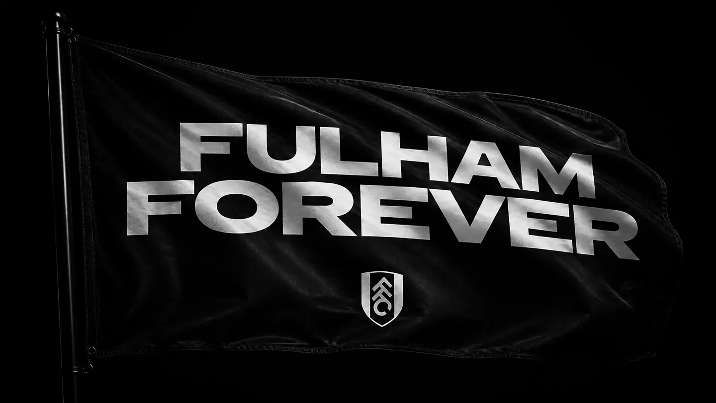
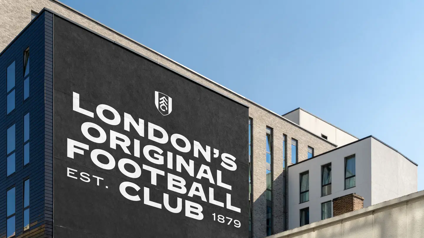
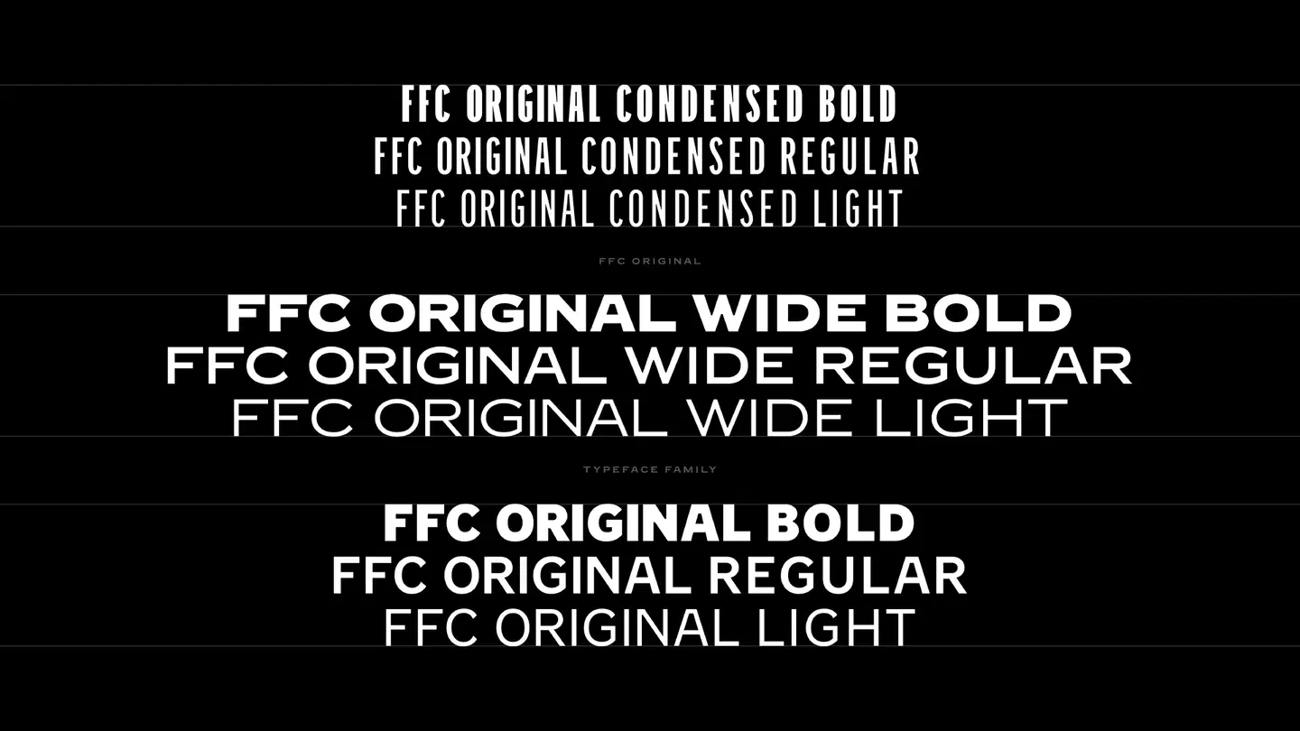
Fulham Football Club has refreshed its visual identity around the one asset most clubs overlook: the building itself. Working with long-term creative agency Music and type foundry F37 Foundry, the club commissioned FFC Original, a bespoke typeface built from hand-rendered lettering found inside Craven Cottage, which the project team describes as the oldest football stadium in London. Music researched the stadium extensively before writing a single brief, treating 145 years of physical signage as the actual foundation of the identity rather than a nostalgic footnote to it.
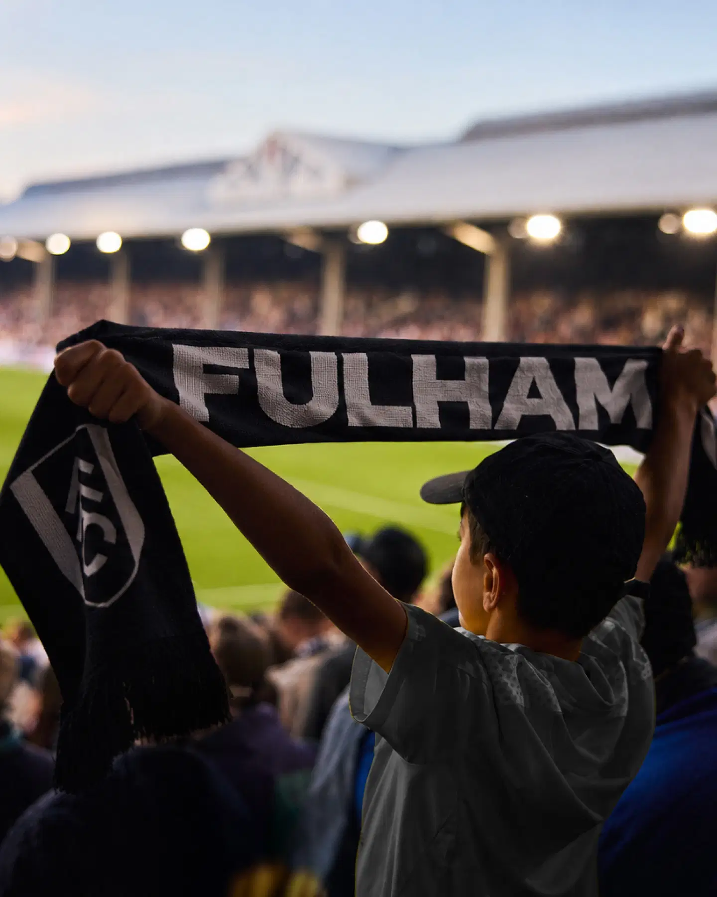
The new identity is already live across matchday graphics, campaigns, retail, and moving image, including a 2026/27 away kit campaign that pulls from 1990s visual language and pairs the new type with a more irreverent tone than the club has used in years. "The heritage is what creates the modern identity," said Dave Simpsons, CEO and executive creative director at Music, which inverts the usual rebrand logic of stripping a legacy mark down to something flatter and more generic.
Jack Burrows, Fulham's marketing director, framed the real brief as an audience problem: "Some of these groups may attend matches regularly, others may never set foot inside Craven Cottage." That is the harder audience to design for than the loyal one in the stands every weekend, and it is the actual reason a 145-year-old building ended up as a typeface instead of a plaque.
More photos


Source: It's Nice That
Kyle Duford, Founder & Editor, BRNDWIRE. More from Kyle →
The Brand Briefing
Liked this? Get five more every morning.
The Brand Briefing: the stories moving brands, in your inbox at 7am your time. Free.