Mytheresa Sands Down Its Logo. That's the Whole Strategy.
The luxury platform's evolved identity is deliberately quiet — a clarity play for a business that now has to sell menswear, kidswear and jewellery under one signature.
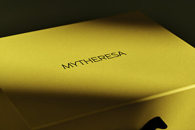
Mytheresa introduced a refined logo and evolved visual identity on Monday, describing the change as a more unified and elevated expression of the brand across womenswear, menswear, kidswear, fine jewellery and life.
Read the category list again and the redesign explains itself. Mytheresa was built as a womenswear specialist with a founder's eye; it is now a multi-category luxury platform with a listed parent and a considerably wider assortment. Identities designed for a single department start to wobble when they have to carry five.
The stated attributes — clarity, elegance, timeless sophistication — are the standard vocabulary of luxury e-commerce restraint, and the Munich company is explicit that the goal is recognisability that adapts cleanly across every touchpoint. In practice that means a mark that survives an app icon, an email header and a shipping box without redrawing.
There is competitive context too. The multi-brand luxury retail model has had a punishing few years, and Mytheresa's pitch against Net-a-Porter and Ssense rests on curation and service rather than breadth of stock. A quieter, more confident signature is consistent with that argument: the platform recedes so the labels can perform.
Nobody buys a handbag because a wordmark got tighter. But for a company asking high-spending customers to treat it as the default front door to luxury, looking like an institution rather than a boutique is not cosmetic — it is the positioning.
Kyle Duford, Founder & Editor, BRNDWIRE. More from Kyle →
The Brand Briefing
Liked this? Get five more every morning.
The Brand Briefing: the stories moving brands, in your inbox at 7am your time. Free.