The Atlanta Falcons' New Logo Drew Nazi Comparisons. By Friday, It Was Gone.
The team's retro-inspired emblem lasted barely 48 hours online before quietly disappearing, no explanation included.
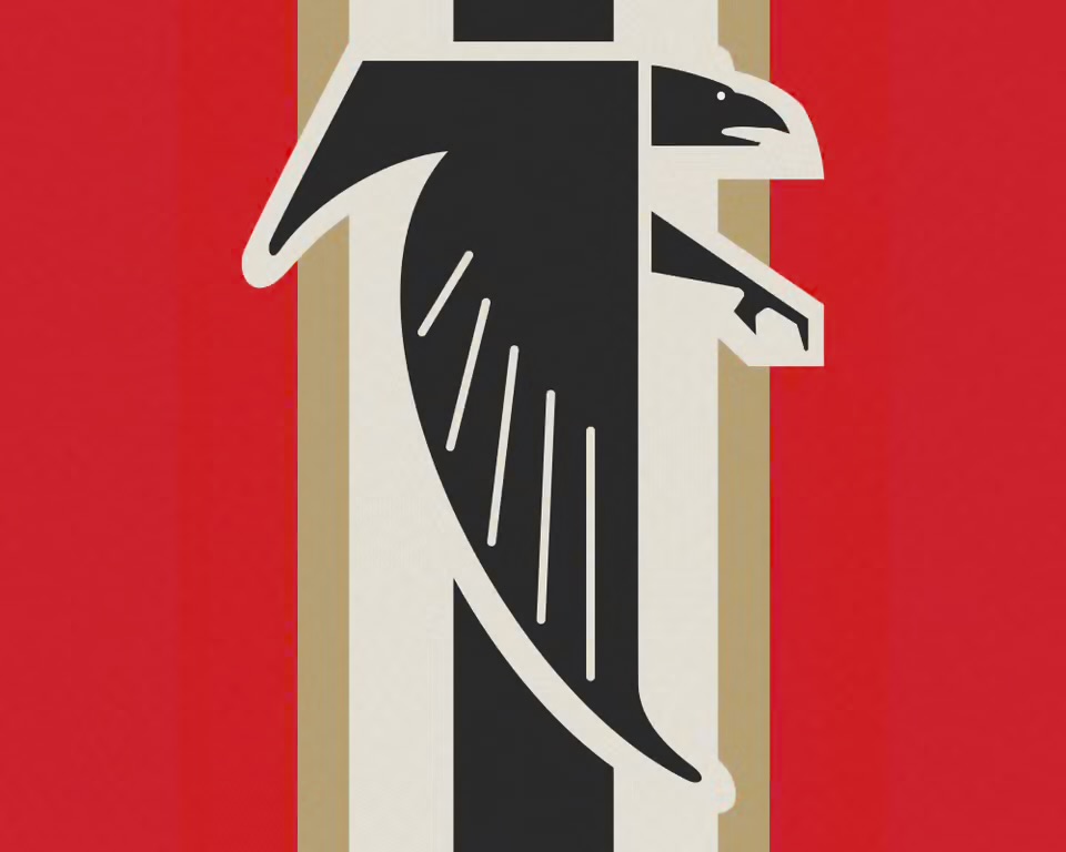
The Atlanta Falcons spent Wednesday rolling out a new profile picture built around their 1966 logo: a black falcon set against red, white, black, and gold stripes. By Thursday, the internet had decided it looked like something else entirely, with fans flooding social media comparing the design to a swastika and World War II-era German military insignia. One user joked the team was "preparing to invade Poland." Another christened it "the bird reich."
By Friday, the image was gone, replaced quietly with a red helmet graphic and the team's standard logo. The Falcons never acknowledged the backlash or explained the switch, and their other social accounts kept posting business as usual through the controversy, like a brand hoping nobody would notice the quiet rebrand of a rebrand.
For a franchise hosting the San Francisco 49ers this Sunday, the lesson is a cheap one: before you dust off a 60-year-old mark for nostalgia points, maybe run it past someone who has seen a World War II documentary. Retro only works until the internet decides it's retro for the wrong reasons.
Source: Yahoo Sports
Kyle Duford, Founder & Editor, BRNDWIRE. More from Kyle →
The Brand Briefing
Liked this? Get five more every morning.
The Brand Briefing: the stories moving brands, in your inbox at 7am your time. Free.